Generating beautiful Visual Reports for Azure DevOps using PowerBI
Before generating reports in PowerBI, we may need to get the data by Analytics View or OData or by different methods as displayed here
Step 1: Create a Analytics view as shown here (For the list of UserStories)
Step 2: Then load the Data using Azure DevOps inbuilt Data connector as shown here
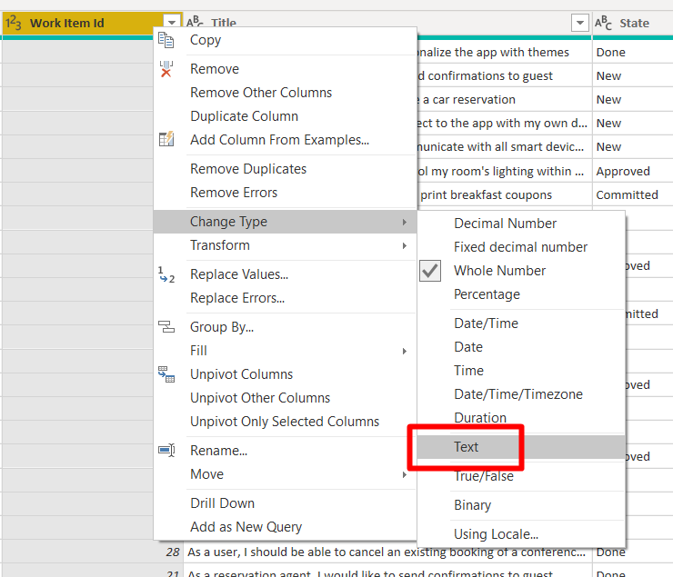
Step 3: After you have clicked on Transform the Data, you may need to make couple of changes before we proceed further .
WorkItem will be summarized when you load the data for visualization, so we may have to either change the data type or click on Don’t summarize as shown below
Step 4: Then Click on either Load Data or Close & Apply
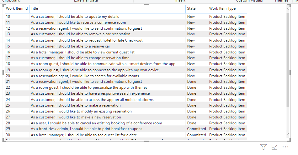
Step 5: Once you have loaded the Data, you will be able to see the query on the right pane with columns you have loaded
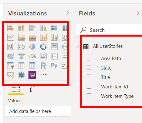
Step 6: Now you can display different reports using the Visualizations on the pane to left of the fields
Some of the graphs you can make are Bar Chart, Pie, Table,Matrix,Stacked Charts etc., and there are many more different graphs you can import from the marketplace
Now let us see how to create some of the necessary reports that is important from a project management perspective
Then you can generate different reports as shown
2.Matrix Report
To generate a matrix report, you need to use a combination of row and column fields with different values as shown (Matrix reports will be more useful when you have links between UserStories and Epics)
So let us create another analytic view for Features as shown below and now let us to try to create a report that links both of them together
Change the data type of workitemID, ParentWorkItem to “Text” in Features as well as in UserStories and then click on Close & Apply at the top